

Responsive website design.


Project overview
Burger&Co. is an online fast food restaurant that offers customers a premium take on fast food classics. Their typical user is between 17-35 years old, with most users being young professionals. Burger&Co.’s goal is to make ordering food online seamless and fun for all types of users.
The project
January 2023 - August 2023
The duration

Available online restaurants don’t offer enough details or customisable options for their food listings. The majority don’t offer order tracking or the ability to contact delivery drivers.
The problem
The goal
Design a Burger&Co. website that users can easily order customisable dishes that can be tracked right to the door

UX designer, leading the Burger&Co. website design
My role
Responsibilities
Conducting interviews, paper and digital wireframing, low and high-fidelity prototyping, conducting usability studies, accounting for accessibility, iterating on designs and responsive design.
Understanding the user
I conducted interviews and created empathy maps to understand the users I’m designing for and their needs. A primary group identified through research was young professionals - the majority who are considerate about what types of food they eat and how they can customise their orders.
In addition, a large number of users found it frustrating when delivery drivers couldn’t find their location, resulting in either missing or cold food. Other issues include no imagery and lacking details of the food listings, which force the users away, towards alternative restaurants.
User research
Empathy maps


Pain points
Restaurants don’t provide details about ingredients or labels stating vegan / vegetarian friendly. Imagery also not included.
“Details”
Delivery drivers having difficulty finding the correct drop off location, resulting in cold food.
“Location”
Restaurants don’t provide users the ability to customise orders, denying those with certain food intolerances the chance of ordering.
“Customise”
Personas


User journey map

I created a user journey map of Ashley’s experience using the site to help identify possible pain points and improvement opportunities.
Starting the design

Site map
My goal here was to make strategic information architecture decisions that would improve overall website navigation. The structure i chose was designed to make things simple and easy.
Paper wireframes
I sketched out paper wireframes for each screen in my website, keeping the user pain points previously detailed in mind. The home screen paper wireframe variations below focus on optimising the browsing experience for users.
Stars were used next to the elements that would be used in the initial digital wireframes. The final paper wireframe uses elements from each of the previous wireframes.


Paper wireframes, screen size variation
Because Burger&Co.’s customers access the site on a variety of different devices, i started work on designs for additional screen sizes to make sure the site would be fully responsive.


Digital wireframes
Easy access buttons at the top of the page
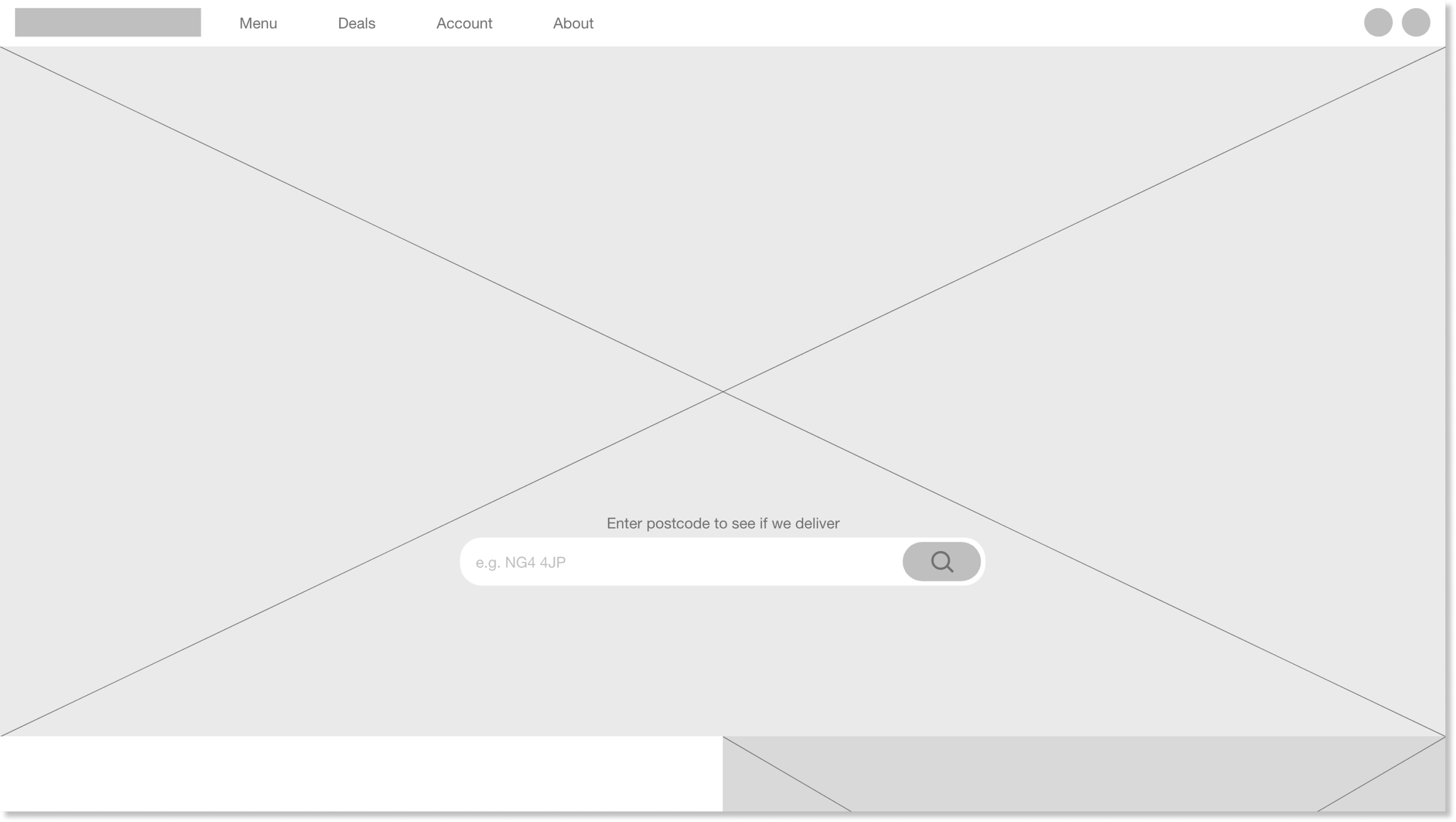
Large hero image welcomes user on the home page
Because Burger&Co.’s customers access the site on a variety of different devices, i started work on designs for additional screen sizes to make sure the site would be fully responsive.
Digital wireframes, mobile
Easy access buttons at the top of the page are now hidden behind a hamburger menu
Large hero image welcomes user on the home page
Low-fidelity prototype
To create a low-fidelity prototype, i connected all of the screens involved in the primary user flow of adding an item to the cart and checking out.
At this point, i had received feedback on my designs from members of my team about things like button placement and page organisation. I made sure to listen to their feedback, and i implemented several suggestions that addressed user pain points.

Usability study: parameters
Study type:
Moderated usability study
Nottingham, remote
Location:
Participants:
5 participants
10 - 15mins
Duration:
Usability study: findings
Users weren’t able to quickly
re-order previous orders, making
them add each item individually.
“Previous orders”
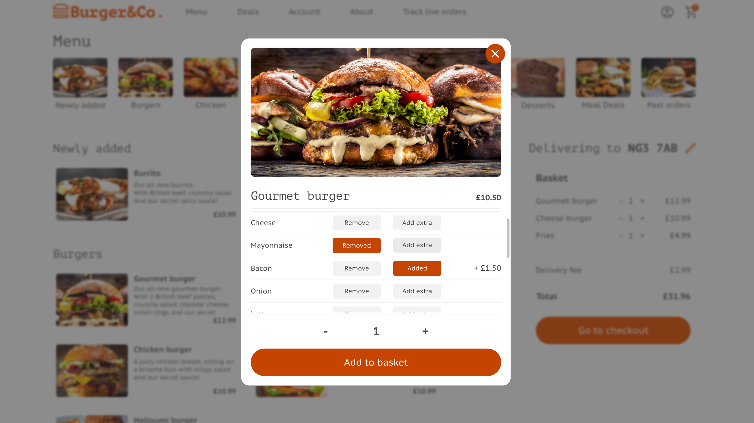
Users didn’t have an option to customise their food items.
“Customise”
5 Once on the review order page, users didn’t have the ability to go back and add extra items.
“Review”
Refining the design: Mock ups
Based on insights from the usability study, i made changes to add a section where users can add and remove ingredients to their food items - giving users more freedom when it comes to choosing food.

Before usability study

After usability study
Refining the design: Mock ups
To help users amend their orders, and add more - i added an ‘add more items’ button on the review order page.
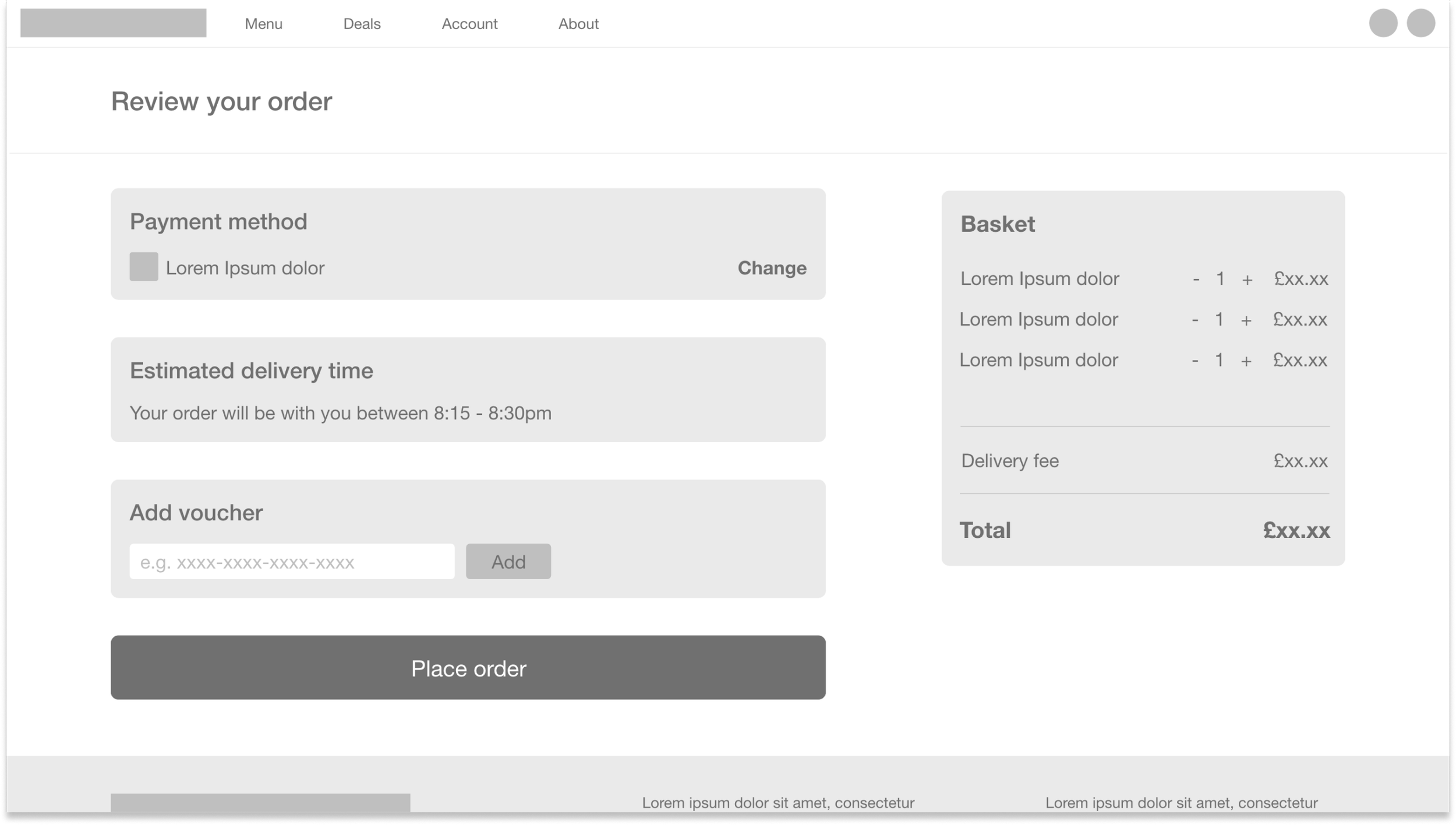
Before usability study

After usability study
Mock ups: Desktop


Mock ups: Mobile
I included considerations for additional screen sizes in my mockups based on earlier wireframes. Because users shop from a variety of devices, i felt it was important to optimise the browsing experience for a range of device sizes, such as mobile so that users have the smoothest experience possible.


High-fidelity prototype: Desktop
My hi-fi prototype followed the same user flow as the lo-fi prototype, and included the design changes made after the usability study.

High-fidelity prototype: Mobile
My hi-fi prototype followed the same user flow as the lo-fi prototype, and included the design changes made after the usability study.

Going forward: Key takeaways
Our target users shared that the design was intuitive to navigate through, more engaging with images, and demonstrated a clear visual hierarchy.
Impact:
I learned that even a small design change can have a huge impact on the user experience. the most important takeaway for me is to always focus on the real needs of the user when coming up with design ideas and solutions
What I learned:
Going forward: Next steps
Conduct follow-up usability testing on the new website.
1
Identify any additional areas of need and ideate on new features.